viewport
Control the size and orientation of the screen for your application.
You can set the viewport's width and height globally by defining viewportWidth
and viewportHeight in the
Cypress configuration.
Syntax
cy.viewport(width, height)
cy.viewport(preset, orientation)
cy.viewport(width, height, options)
cy.viewport(preset, orientation, options)
Usage
Correct Usage
cy.viewport(550, 750) // Set viewport to 550px x 750px
cy.viewport('iphone-6') // Set viewport to 375px x 667px
Arguments
width (Number)
Width of viewport in pixels (must be a non-negative, finite number).
height (Number)
Height of viewport in pixels (must be a non-negative, finite number).
preset (String)
A preset dimension to set the viewport. Preset supports the following options:
| Preset | width | height |
|---|---|---|
ipad-2 | 768 | 1024 |
ipad-mini | 768 | 1024 |
iphone-3 | 320 | 480 |
iphone-4 | 320 | 480 |
iphone-5 | 320 | 568 |
iphone-6 | 375 | 667 |
iphone-6+ | 414 | 736 |
iphone-7 | 375 | 667 |
iphone-8 | 375 | 667 |
iphone-x | 375 | 812 |
iphone-xr | 414 | 896 |
iphone-se2 | 375 | 667 |
macbook-11 | 1366 | 768 |
macbook-13 | 1280 | 800 |
macbook-15 | 1440 | 900 |
macbook-16 | 1536 | 960 |
samsung-note9 | 414 | 846 |
samsung-s10 | 360 | 760 |
orientation (String)
The orientation of the screen. The default orientation is portrait. Pass
landscape as the orientation to reverse the width/height.
options (Object)
Pass in an options object to change the default behavior of cy.viewport().
| Option | Default | Description |
|---|---|---|
log | true | Displays the command in the Command log |
Yields
cy.viewport()yieldsnull.
Examples
Width, Height
Resize the viewport to 1024px x 768px
cy.viewport(1024, 768)
Organize desktop vs mobile tests separately
describe('Nav Menus', () => {
  context('720p resolution', () => {
    beforeEach(() => {
      // run these tests as if in a desktop
      // browser with a 720p monitor
      cy.viewport(1280, 720)
    })

    it('displays full header', () => {
      cy.get('nav .desktop-menu').should('be.visible')
      cy.get('nav .mobile-menu').should('not.be.visible')
    })
  })

  context('iphone-5 resolution', () => {
    beforeEach(() => {
      // run these tests as if in a mobile browser
      // and ensure our responsive UI is correct
      cy.viewport('iphone-5')
    })

    it('displays mobile menu on click', () => {
      cy.get('nav .desktop-menu').should('not.be.visible')
      cy.get('nav .mobile-menu')
        .should('be.visible')
        .find('i.hamburger')
        .click()

      cy.get('ul.slideout-menu').should('be.visible')
    })
  })
})
Dynamically test multiple viewports
- End-to-End Test
- Component Test
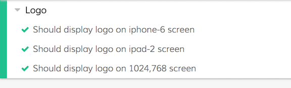
const sizes = ['iphone-6', 'ipad-2', [1024, 768]]

describe('Logo', () => {
  sizes.forEach((size) => {
    // make assertions on the logo using
    // an array of different viewports
    it(`Should display logo on ${size} screen`, () => {
      if (Cypress._.isArray(size)) {
        cy.viewport(size[0], size[1])
      } else {
        cy.viewport(size)
      }

      cy.visit('https://example.cypress.io')
      cy.get('#logo').should('be.visible')
    })
  })
})
const sizes = ['iphone-6', 'ipad-2', [1024, 768]]

describe('Logo', () => {
  sizes.forEach((size) => {
    // make assertions on the logo using
    // an array of different viewports
    it(`Should display logo on ${size} screen`, () => {
      if (Cypress._.isArray(size)) {
        cy.viewport(size[0], size[1])
      } else {
        cy.viewport(size)
      }

      cy.mount(<MyComponent />)
      cy.get('#logo').should('be.visible')
    })
  })
})
Preset
Resize the viewport to iPhone 6 width and height
cy.viewport('iphone-6') // viewport will change to 414px x 736px
Orientation
Change the orientation to landscape
// the viewport will now be changed to 736px x 414px
// and simulates the user holding the iPhone in landscape
cy.viewport('iphone-6', 'landscape')
Notes
devicePixelRatio
devicePixelRatio is not simulated
Follow #7075 if you need this supported.
Restores
Cypress will restore the viewport in the snapshot
When hovering over each command, Cypress will automatically display the snapshot in the viewport dimensions that existed when that command ran.
Defaults
Default sizing
By default, until you issue a cy.viewport() command, Cypress sets the width to
1000px and the height to 660px by default.
You can change these default dimensions by adding the following to your Cypress configuration:
- cypress.config.js
- cypress.config.ts
const { defineConfig } = require('cypress')

module.exports = defineConfig({
  viewportWidth: 1000,
  viewportHeight: 660,
})
import { defineConfig } from 'cypress'

export default defineConfig({
  viewportWidth: 1000,
  viewportHeight: 660,
})
Additionally, Cypress automatically sets the viewport to its default size between each test.
Scaling
Auto Scaling
By default, if your screen is not large enough to display all of the current dimension's pixels, Cypress will scale and center your application within the preview pane to accommodate.
Scaling the app should not affect any calculations or behavior of your application (in fact it won't even know it's being scaled).
The upsides to this are that tests should consistently pass or fail regardless
of a developers' screen size. Tests will also consistently run in CI because
all of the viewports will be the same no matter what machine Cypress runs on.
Reset viewport via Cypress.config()
You can change the size of the viewport height and width for the remainder of
the tests by setting the new values for viewportHeight or viewportWidth
within Cypress.config().
Cypress.config('viewportWidth', 800)
Cypress.config('viewportWidth') // => 800
Set viewport in the test configuration
You can configure the size of the viewport height and width within a suite or test by passing the new configuration value within the test configuration.
This will set the height and width throughout the duration of the tests, then
return it to the default viewportHeight and viewportWidth when complete.
describe(
  'page display on medium size screen',
  {
    viewportHeight: 1000,
    viewportWidth: 400,
  },
  () => {
    it('does not display sidebar', () => {
      cy.get('#sidebar').should('not.be.visible')
    })

    it('shows hamburger menu', () => {
      cy.get('#header').find('i.menu').should('be.visible')
    })
  }
)
Rules
Requirements
cy.viewport()requires being chained off ofcy.
Assertions
cy.viewport()cannot have any assertions chained.
Timeouts
cy.viewport()cannot time out.
Command Log
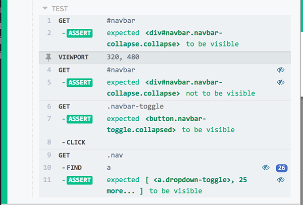
Change viewport size to test responsive nav
cy.get('#navbar').should('be.visible')

cy.viewport(320, 480)

// the navbar should have collapse since our screen is smaller
cy.get('#navbar').should('not.be.visible')
cy.get('.navbar-toggle').should('be.visible')
cy.get('.navbar-toggle').click()
cy.get('.nav').find('a').should('be.visible')
The commands above will display in the Command Log as:
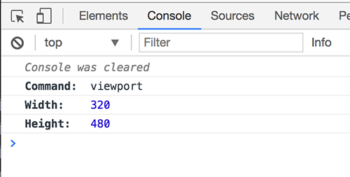
When clicking on viewport within the command log, the console outputs the
following:
History
| Version | Changes |
|---|---|
| 5.5.0 | Added support for macbook-16 preset. |
| 5.4.0 | Added support for presets iphone-7, iphone-8, and iphone-se2. |
| 3.8.0 | Removed max viewport size and lowered min viewport size to 0. |
| 3.5.0 | Added support for presets iphone-xr, iphone-x, samsung-s10, and samsung-note9 |
| 3.5.0 | Increased max viewport size to 4000 |
| 0.9.0 | cy.viewport() command added |
See also
- Read blog post Use meaningful smoke tests where we run the same test with different viewport resolutions
- Read blog post Generate High-Resolution Videos and Screenshots to learn how to change the browser's window size to capture screenshots and videos with more detail
- Configuration
- Cypress.config()