Element Grouping
Applications reuse the same control in many places. A product listing renders an "Add to cart" button on every card, and a data table renders the same action button on every row. UI Coverage sees each rendered button as its own interactive element, so without grouping a single page can add hundreds of near-identical elements to your report, each counted on its own. Because these buttons all behave the same way, testing one is enough to verify the rest. Without grouping, though, every button a test doesn't touch still counts as untested and lowers your coverage score.
UI Coverage solves this by grouping elements that behave the same way. A group counts once toward your coverage score, and interacting with any element in the group marks the whole group as tested. Fifty untested product cards become one clearly named group that a single test can cover.
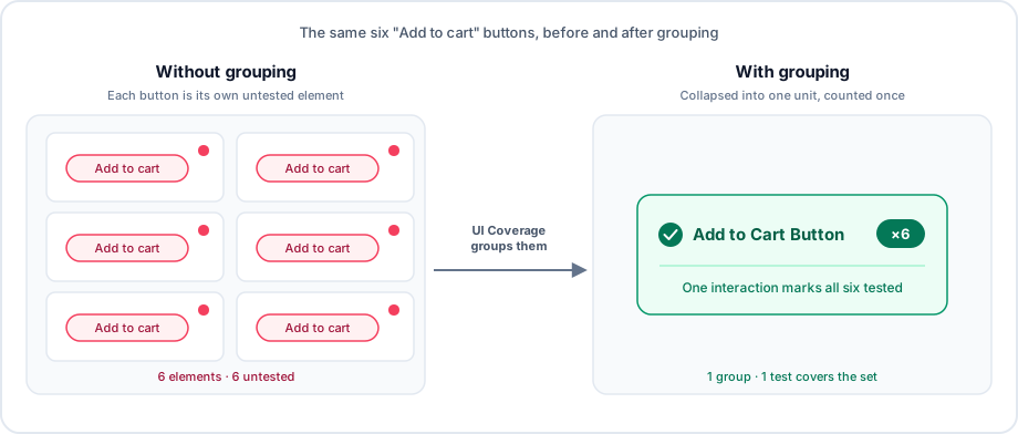
How grouping affects your report and score
Grouping changes what you see and what you're measured against:
- The group counts once. A group of 50 buttons contributes a single unit to your total element count, not 50.
- One interaction covers the group. Testing any one member marks the entire group as tested, since every member shares the same behavior.
- Reports stay readable. A group appears as one row, labeled by a shared attribute or a name you choose, instead of a long list of machine-generated selectors.
Automatic grouping
Out of the box, with no configuration, UI Coverage groups elements it can recognize as variations of the same control. It uses structural and behavioral signals from the DOM:
- Shared test attributes. Interactive elements with the same test attribute value are grouped (
data-cy,data-test,data-testid,data-test-id,data-qa,row-id, or any attribute you add tosignificantAttributes). For example, adata-cy="favorite"button repeated on every product card. Theidandnamefallbacks used for element identity do not group elements.- Forms are a boundary. Elements with the same test attribute inside different identified form-like ancestors are grouped separately, so a
<button data-cy="submit">inside<form id="signup">isn't grouped with one inside<form id="login">. Reports show these as#signup [data-cy="submit"]and#login [data-cy="submit"]. "Form-like" means a<form>element, an element withrole="form", or a custom element whose tag name ends inform, such as<checkout-form>. This keeps a generic attribute likedata-cy="submit"from collapsing every form in your app into one group. If you want to group them anyway, useelementGroups.
- Forms are a boundary. Elements with the same test attribute inside different identified form-like ancestors are grouped separately, so a
- Form controls and their labels. A
<label>is grouped with the form control it identifies, so the pair counts as one unit instead of two. - Table and grid rows. Controls in the same position across sibling rows are grouped, in
<table>elements and ARIA grids (role="grid",role="table", androle="treegrid"). - Repeated structures. Elements that sit at the same depth in the DOM and share a tag and class hierarchy up to a common parent are grouped, catching repeated lists and cards that behave alike even without test attributes. Elements stay separate when their tag names differ, their
idvalues differ, or (for<input>and<button>) theirtypeattributes differ. - Links to the same view. Links whose
hrefresolves to the same view are represented by that view instead of listed separately. Same-page fragment links such as#pricinghave no view, so they group only with other links whosehrefis exactly the same.
Automatic grouping requires at least two similar elements. A control that appears only once stays on its own.
Example: repeated controls in a table
Consider a customer table where each row has a "Delete" button:
<table>
  <tr>
    <td>Aisha Rahman</td>
    <td>
      <button>Delete</button>
    </td>
  </tr>
  <tr>
    <td>Mateo Ramirez</td>
    <td>
      <button>Delete</button>
    </td>
  </tr>
</table>
The "Delete" buttons occupy the same position in sibling rows, so UI Coverage groups them. A test that deletes one customer marks the group as tested, and the report shows a single "Delete" group instead of one element per row.
Custom grouping
Automatic grouping handles most cases, but you can override it when it collapses too much, too little, or names things unhelpfully. You have two ways to take control: centrally in Cypress Cloud, or in your application's markup.
Grouping with configuration
When you want to manage grouping centrally in Cypress Cloud without changing application code, use the elementGroups configuration. Each rule matches interactive elements with a CSS selector and collects them into one named group. This is the right tool when the team reading the reports isn't the team that owns the markup, or when you want to correct the automatic grouping without a code change.
{
  "uiCoverage": {
    "elementGroups": [
      {
        "selector": "[data-cy^='add-to-cart-']",
        "name": "Add to Cart Button"
      }
    ]
  }
}
The elementGroups configuration guide covers the full syntax, including how to name groups, order rules, and scope them to specific iframes or shadow DOM hosts with documentScope.
Grouping with markup attributes
You can also define groups directly in your application's markup with the data-cy-ui-group attribute, without any Cypress Cloud configuration. Elements that share the same attribute value are grouped together, and the group appears in reports under a selector formatted with that value, such as [data-cy-ui-group="pagination"].
<button data-cy-ui-group="pagination">1</button>
<button data-cy-ui-group="pagination">2</button>
<button data-cy-ui-group="pagination">3</button>
Where you place the attribute determines what it groups:
- On an interactive element, it groups that element only.
- On a wrapper or parent element, it groups every interactive element inside it.
- On nested wrappers, each interactive element joins the group of its closest ancestor that has the attribute.
Groups defined this way take priority over every other grouping mechanism, including elementGroups configuration rules. Reach for the attribute when the team that owns the markup also owns the grouping decisions.
See also
elementGroupsdefines custom groups in Cypress Cloud and overrides the automatic rules.significantAttributeschanges which attributes identify and group elements.elementFiltersremoves elements from reports entirely, so they're never grouped or scored.- Element Identification explains the significant attributes that drive grouping and how elements are recognized across snapshots.
- Guide: Reduce noise in UI Coverage reports walks through combining grouping and filtering to clean up a report.
- UI Coverage FAQ answers common questions about grouping, scores, and configuration.