Exclude elements - elementFilters
The elementFilters configuration removes elements from your UI Coverage report. An excluded element doesn't appear in the report and doesn't count toward your coverage score, whether it was tested or not.
By default, UI Coverage tracks every interactive element that appears in your application during your tests, including elements you never intend to test: the buttons of a third-party chat widget, links in an embedded cookie banner, controls rendered by an analytics overlay. Each of these counts as an untested element and drags down your score, burying the coverage gaps you actually care about. An elementFilters rule removes them, so your report and score reflect only the elements your team is responsible for testing.
Why use elementFilters?
- Ignore third-party components: Chat widgets, cookie banners, embedded media players, and other elements rendered by libraries or services you don't control can be excluded, since your team isn't responsible for testing them.
- Exclude elements you've decided not to test: Remove test-only controls, decorative elements, or areas of the application that are out of scope for your testing strategy.
- Keep reports actionable: A score and untested-elements list that only contain elements you could realistically test make coverage gaps easier to spot and prioritize.
Excluding an element removes it from the report entirely. If your goal is different, such as combining repeated elements so they count as one, or renaming an element, see Which option do I need? in the configuration overview. To exclude entire pages, use viewFilters instead.
Scope
Note: setting elementFilters at the root of your configuration impacts both UI Coverage and Cypress Accessibility reports. To configure the products separately, nest the property under a uiCoverage or accessibility key. A nested elementFilters completely replaces a root-level one for that product; the two lists are not merged.
Setting elementFilters
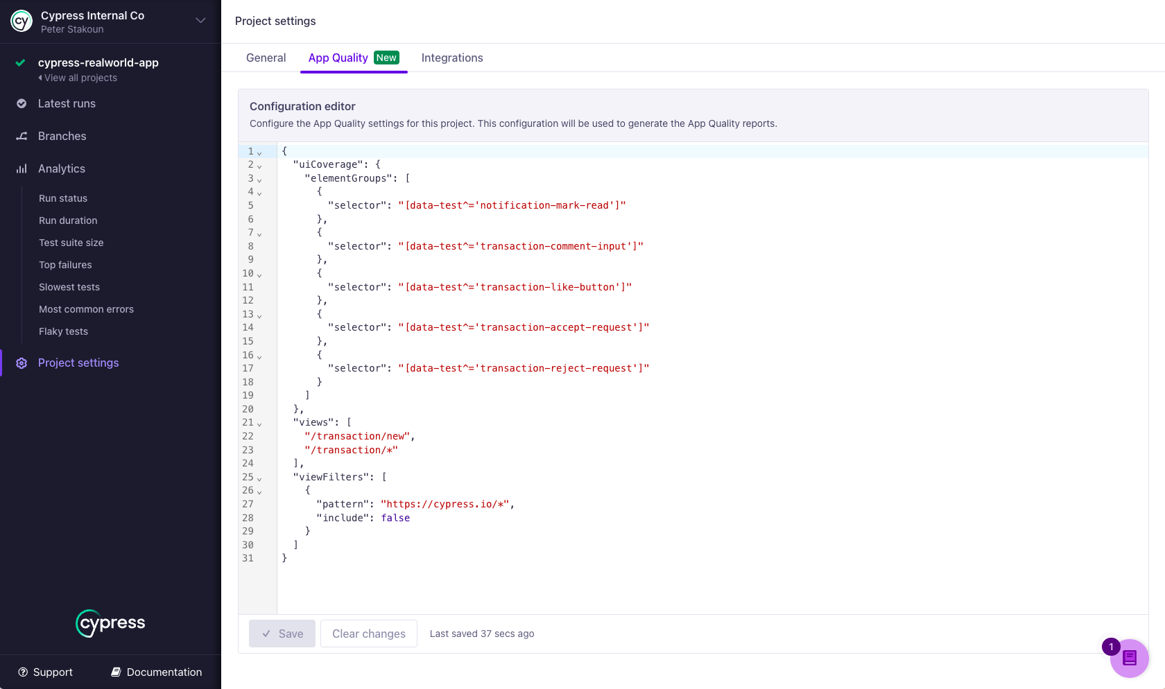
To add or edit elementFilters, open the App Quality tab in your project settings in Cypress Cloud. See Setting configuration for details, including how to regenerate past reports with a new configuration without rerunning your tests.
Syntax
{
  "elementFilters": [
    {
      "selector": string,
      "include": boolean,
      "documentScope": [string],
      "comment": string
    }
  ]
}
To apply rules to UI Coverage only, nest the property under the uiCoverage key:
{
  "uiCoverage": {
    "elementFilters": [
      {
        "selector": string,
        "include": boolean
      }
    ]
  }
}
Options
| Option | Required | Default | Description |
|---|---|---|---|
selector | Required | A CSS selector that matches the elements to include or exclude. Supports standard CSS selector syntax, including IDs, classes, attributes, combinators, and functional pseudo-classes like :has(). The selector must match the interactive element itself, not just a container around it. | |
include | Required | Whether elements matched by this rule appear in the report. Use false to exclude the matched elements. Use true to protect elements from broader exclude rules later in the list. See When to use include: true. | |
documentScope | Optional | An ordered array of CSS selectors that match document hosts (iframes or shadow DOM hosts) in the element's ancestor chain, from outermost to innermost. Use this to limit a rule to elements inside a specific iframe or shadow DOM. Hosts that aren't listed may appear between the ones that are. | |
comment | Optional | A note about why this rule exists, for your team's benefit. Comments appear only in the configuration itself. They have no effect on filtering and are not displayed in reports. |
How are elementFilters rules applied?
- The first matching rule wins. Rules are evaluated in the order they are defined, and each element is included or excluded by the first rule whose
selector(anddocumentScope, when present) matches it. Later rules never apply to that element, so an earlyinclude: truerule protects its elements from a broader exclude rule below it. List specific rules before general ones. - Elements that match no rule are included. Everything is included by default, so a rule with
include: trueon its own changes nothing. To limit the report to only certain elements, pair include rules with a catch-all exclude rule like{ "selector": "*", "include": false }at the end of the list. - The selector must match the interactive element itself. Filters are evaluated against the interactive elements UI Coverage tracks, using standard CSS matching. A rule with the selector
footermatches only a<footer>element, not the buttons and links inside it. To exclude everything within a container, use a descendant selector such asfooter *. - Excluded elements are removed everywhere. They don't appear in any view, don't count toward the totals or the coverage score, and aren't considered by
elementGroupsorelementsrules. Interactions with them are removed as well. - Rules match in any document unless scoped. A rule without
documentScopecan match elements in the main document, in iframes, and in shadow DOMs. AdddocumentScopeto restrict a rule to one of those documents.
If a rule doesn't seem to take effect, see Why isn't my elementFilters rule excluding an element? in the UI Coverage FAQ.
Validation rules
Cypress Cloud rejects a configuration when:
- Two rules have the same
selector(with the samedocumentScope). Only the first could ever apply, so duplicates are treated as mistakes. - A rule is missing
selectororinclude. - A
selectorordocumentScopeentry isn't valid CSS selector syntax. - A rule contains a property other than the four listed above.
Examples
Exclude a specific element
Config
{
  "elementFilters": [
    {
      "selector": "#button-2",
      "include": false,
      "comment": "Test-only button, not part of the product UI"
    }
  ]
}
HTML
<body>
  <button id="button-1">Included</button>
  <button id="button-2">Excluded</button>
</body>
Elements shown in UI
#button-1
Exclude all elements in a container
The descendant selector footer * matches every element inside the footer. A rule with the selector footer alone would not work here, because it matches only the <footer> element itself, not the interactive elements within it.
Config
{
  "elementFilters": [
    {
      "selector": "footer *",
      "include": false
    }
  ]
}
HTML
<body>
  <main>
    <button id="start">Included</button>
  </main>
  <footer>
    <a href="#">Excluded</a>
  </footer>
</body>
Elements shown in UI
#start
Include only elements in a specific container
Because the first matching rule wins, the include: true rule protects the form's elements from the catch-all exclude rule that follows it.
Config
{
  "elementFilters": [
    {
      "selector": "#form *",
      "include": true
    },
    {
      "selector": "*",
      "include": false
    }
  ]
}
HTML
<body>
  <form id="form">
    <input id="name" />
  </form>
  <footer>
    <a href="#">Excluded</a>
  </footer>
</body>
Elements shown in UI
#name
Exclude elements by attribute
Config
{
  "elementFilters": [
    {
      "selector": "[data-role='decorative']",
      "include": false
    }
  ]
}
HTML
<body>
  <button data-role="decorative">
    <img src="icon.png" />
  </button>
  <button data-role="primary">
    View
  </button>
</body>
Elements shown in UI
[data-role="primary"]
Exclude dynamic elements by pattern
Attribute prefix, suffix, and substring selectors ([class^='...'], [class$='...'], [class*='...']) are useful when class names or IDs are partially generated.
Config
{
  "elementFilters": [
    {
      "selector": "[class^='auth']",
      "include": false
    }
  ]
}
HTML
<body>
  <button class="cancel">Cancel</button>
  <button class="auth908283794">Login</button>
</body>
Elements shown in UI
.cancel
Exclude disabled elements
UI Coverage tracks disabled elements by default, since they often become enabled later and represent potential untested paths. If you don't intend to test them, exclude them by their disabled attribute.
Config
{
  "elementFilters": [
    {
      "selector": "[disabled]",
      "include": false
    }
  ]
}
HTML
<body>
  <button data-cy='cancel'>Cancel</button>
  <button disabled data-cy='submit'>Submit</button>
</body>
Elements shown in UI
[data-cy='cancel']
Exclude elements inside a shadow DOM or iframe
Use documentScope to limit a rule to elements inside a specific shadow DOM host or iframe. Here, the button inside the <custom-component> shadow root shares its id with a button in the main document. The scope restricts the rule to the shadow DOM, so the button in the main document stays in the report.
Config
{
  "elementFilters": [
    {
      "selector": "#my-button",
      "include": false,
      "documentScope": ["custom-component"]
    }
  ]
}
HTML
<body>
  <button id="my-button">Button Outside Shadow DOM - Important</button>
  <custom-component>
    #shadow-dom
      <button id="my-button">Button Inside Shadow DOM - Not Important</button>
  </custom-component>
</body>
Elements shown in UI
#my-button (from root document)
documentScope works the same way for content that renders inside an iframe. The scope selector matches the iframe element itself in its parent document:
{
  "elementFilters": [
    {
      "selector": "#my-button",
      "include": false,
      "documentScope": ["#my-iframe"]
    }
  ]
}
For nested documents, list one selector per host from outermost to innermost. For example, "documentScope": ["#my-iframe", "custom-component"] scopes a rule to a shadow DOM component rendered inside an iframe.
Exclude everything inside a document
A wildcard selector combined with documentScope excludes all elements within a specific iframe or shadow DOM host, which is a common way to remove an entire third-party embed from reports.
Config
{
  "elementFilters": [
    {
      "selector": "*",
      "include": false,
      "documentScope": ["external-component"]
    }
  ]
}
HTML
<body>
  <button id="important">Important Button</button>
  <external-component>
    #shadow-dom
      <button id="unimportant-1">Unimportant</button>
      <input id="unimportant-2" />
      <a href="#" id="unimportant-3">Link</a>
  </external-component>
</body>
Elements shown in UI
#important
When to use include: true
Because the first matching rule wins, an include: true rule placed before a broader exclude rule keeps its elements in the report. Include only elements in a specific container above uses this with a catch-all exclude rule, and the same protection works with narrower exclude rules.
Note that this protection is specific to UI Coverage. When a root-level elementFilters list is shared with Cypress Accessibility, that product treats include rules as inert, so the same list can behave differently per product.
Config
{
  "elementFilters": [
    {
      "selector": "nav a",
      "include": true,
      "comment": "Keep nav links in UI Coverage despite the vendor exclude below"
    },
    {
      "selector": "[data-vendor] a",
      "include": false,
      "comment": "Ignore links rendered by the vendor toolbar"
    }
  ]
}
HTML
<body>
  <nav data-vendor="toolbar">
    <a href="/home">Home</a>
  </nav>
  <div data-vendor="promos">
    <a href="https://vendor.example">Sponsored</a>
  </div>
</body>
Elements shown in UI
/home
The Home link matches both rules, but the include rule matches first, so the link stays in the report while the sponsored link is excluded. In Cypress Accessibility, reading the same root-level list, the exclude rule ignores both links, because include rules have no effect there.
To get different outcomes per product, nest a separate elementFilters list under each product key instead of sharing one root-level list.
After saving configuration changes, regenerate a recent run to preview the effect of your rules without rerunning your tests. See Setting configuration for how to regenerate a report.
See also
- Ignore elements guide: a walkthrough of finding and excluding irrelevant elements.
viewFilters: exclude entire pages and the links that point to them.elementGroups: combine related elements into one group instead of removing them.elements: rename an element or stabilize its identity.- Interactivity: which elements UI Coverage tracks in the first place.
- Configuration overview: where to set configuration and regenerate reports.
- UI Coverage FAQ: common questions and troubleshooting.