Stabilize element identity - elements
The elements configuration assigns a stable identity and a display name to a single element in your UI Coverage report.
As your tests run, UI Coverage captures snapshots of your application's DOM, and the same element usually appears in many of them: on every page load, in every test that visits its page. To count that element once, UI Coverage must recognize it as the same element in every snapshot. When one of its attributes is different on each appearance, such as an id generated on every page load, that recognition fails, and each appearance is reported as a new element. One dropdown then shows up as several untested elements and drags down your score.
An elements rule fixes this by identifying the element with a selector you choose that matches in every snapshot. The element counts once, and you can rename it to something readable like "Help Popover" instead of a machine-generated selector.
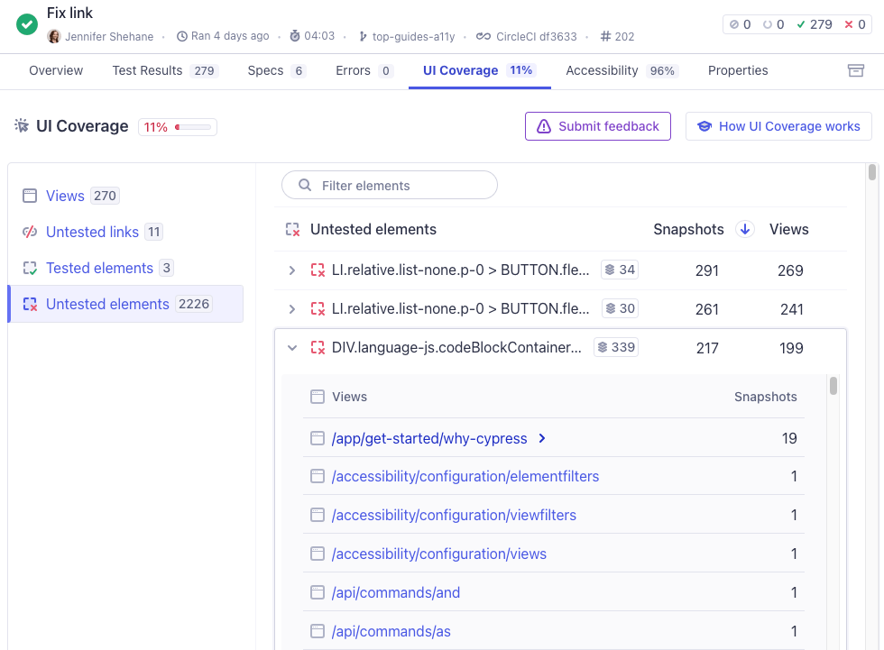
Without stable identities and names, a report can list controls under machine-generated selectors that are hard to recognize and act on:
Why use elements?
UI Coverage already identifies elements automatically using significant attributes, location, and other DOM signals. Use elements when the automatic identity for a specific element isn't stable or isn't readable:
- Stabilize an element's identity: Identify an element by a selector that stays the same across snapshots, even when its
idor other attributes are regenerated on every render, so it isn't duplicated in reports. - Rename elements in reports: Display a human-readable name in place of a machine-generated selector, so anyone reading the report understands what needs testing.
If your goal is different, such as combining repeated elements so they count as one, or removing elements from reports entirely, see Which option do I need? in the configuration overview.
Setting elements
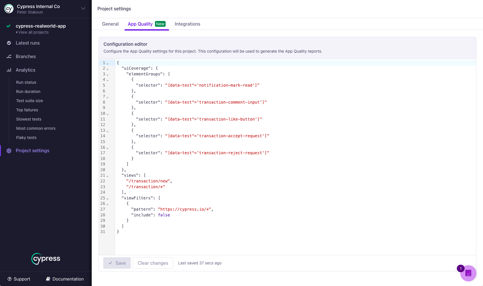
To add or edit elements, open the App Quality tab in your project settings in Cypress Cloud. See Setting configuration for details, including how to regenerate past reports with a new configuration without rerunning your tests.
Syntax
{
  "uiCoverage": {
    "elements": [
      {
        "selector": string,
        "name": string,
        "documentScope": [string],
        "comment": string
      }
    ]
  }
}
Options
| Option | Required | Default | Description |
|---|---|---|---|
selector | Required | A CSS selector that identifies the element. Supports standard CSS selector syntax, including IDs, classes, attributes, combinators, and functional pseudo-classes like :has(). The rule applies only when exactly one interactive element matches. | |
name | Optional | selector | A human-readable name for the element, displayed in UI Coverage reports in place of the selector. Each rule's name must be unique. |
documentScope | Optional | An ordered array of CSS selectors that match document hosts (iframes or shadow DOM hosts) in the element's ancestor chain, from outermost to innermost. Use this to identify an element inside a specific iframe or shadow DOM. Hosts that aren't listed may appear between the ones that are. | |
comment | Optional | A note about why this rule exists, for your team's benefit. Comments have no effect on how elements are identified. |
How are elements rules applied?
In each snapshot captured by your tests, every rule is evaluated independently:
- A rule applies only when it matches exactly one element. A rule identifies a single element, so UI Coverage counts how many of the interactive elements it tracks match the rule's
selectorin the snapshot. If exactly one matches, the rule applies to that element. If two or more match, the rule is skipped and the elements keep their default identity, because applying it would merge separate elements into one. To intentionally treat several elements as one unit, useelementGroupsinstead. Matches against parts of the page that UI Coverage doesn't track, such as wrapper containers or static text, don't count. - Matching is evaluated per snapshot. A rule can apply in one snapshot and be skipped in another where its selector matches several elements at once.
- A matched element is identified by the rule's
selectoralone. Its identity no longer depends on its attributes, structure, or the default element identification rules, so it stays one element across snapshots even as dynamic attributes change. The report displays the rule'sname, or itsselectorwhen no name is given. This includes links, which are otherwise displayed by their URL. - Rules match in any document unless scoped. A rule without
documentScopecan match elements in the main document, in iframes, and in shadow DOMs. AdddocumentScopeto restrict a rule to one of those documents, for example when the same selector appears both inside and outside an iframe. - Later rules take precedence. When more than one rule matches the same element, the last matching rule in the list determines its identity and name.
- Filtered elements are never matched. Elements excluded from reports by
elementFiltersare not considered, and don't count toward a rule's one-match limit.
If a rule doesn't seem to take effect, see Why isn't my elements rule applying? in the UI Coverage FAQ.
Validation rules
Cypress Cloud rejects a configuration when:
- Two rules have the same
selector(with the samedocumentScope). - Two rules have the same
name, or one rule'snamematches another rule'sselector. Elements are identified by these values, so they must be unique. - A
selectorordocumentScopeentry isn't valid CSS selector syntax. - A rule contains a property other than the four listed above.
Examples
Stabilize an element with a dynamic ID
This form's dropdown gets a newly generated id on every page load, so each snapshot produces what looks like a new element. A rule with an attribute prefix selector identifies it as one element across snapshots.
Config
{
  "uiCoverage": {
    "elements": [
      {
        "selector": "#my-form [id^='dropdown']"
      }
    ]
  }
}
HTML
<!-- Snapshot 1 -->
<body>
  <form id="my-form">
    <input id="dropdown-142" />
  </form>
</body>

<!-- Snapshot 2 -->
<body>
  <form id="my-form">
    <input id="dropdown-980" />
  </form>
</body>
Elements shown in UI
Without the rule, the dropdown can appear as two untested elements:
#dropdown-142
#dropdown-980
With the rule, it appears once, displayed under the rule's selector because no name is given:
#my-form [id^='dropdown']
An elements rule is the right tool when one specific element needs a stable identity. If many elements share the same generated attribute, fix the attribute instead: an attributeFilters rule stops it from identifying any element.
Give an element a readable name
Add a name so the report describes the interface instead of your selectors.
Config
{
  "uiCoverage": {
    "elements": [
      {
        "selector": "#ui-popover-button",
        "name": "Help Popover"
      }
    ]
  }
}
HTML
<body>
  <button id="ui-popover-button">Help</button>
</body>
Elements shown in UI
Help Popover
Identify an element inside a shadow DOM or iframe
Use documentScope to identify an element inside a specific shadow DOM host or iframe. Here, the button inside the <custom-component> shadow root shares its id with a button in the main document. The scope restricts the rule to the shadow DOM, so the rule matches exactly one element and applies. Without documentScope, the rule would match both buttons and be skipped.
Config
{
  "uiCoverage": {
    "elements": [
      {
        "selector": "#my-button",
        "name": "Custom Component Button",
        "documentScope": ["custom-component"]
      }
    ]
  }
}
HTML
<body>
  <button id="my-button">Button Outside Shadow DOM</button>
  <custom-component>
    #shadow-dom
      <button id="my-button">Button Inside Shadow DOM</button>
  </custom-component>
</body>
Elements shown in UI
#my-button
Custom Component Button
The button inside the shadow DOM appears under its configured name, while the button in the main document keeps its default identity.
documentScope works the same way for embedded content that renders inside an iframe. The scope selector matches the iframe element itself in its parent document:
{
  "uiCoverage": {
    "elements": [
      {
        "selector": "#submit",
        "name": "Embedded Form Submit",
        "documentScope": ["#embedded-form"]
      }
    ]
  }
}
For nested documents, list one selector per host from outermost to innermost, for example "documentScope": ["#embedded-form", "secure-card-input"].
After saving configuration changes, regenerate a recent run to preview the effect of your rules without rerunning your tests. See Setting configuration for how to regenerate a report.
See also
- Element Identification: how elements are identified automatically.
elementGroups: combine related elements into one group.attributeFilters: stop dynamic attributes from identifying elements.elementFilters: remove elements from reports entirely.- Configuration overview: where to set configuration and regenerate reports.
- UI Coverage FAQ: common questions and troubleshooting.